

It's pronounced "basic"
Wanderings 001: Bassike

When I was 23, I moved to Sydney to work for Mambo. I’d been feeding them graphics from Melbourne—so many that they decided to bring me in-house. The job didn’t last long—just under five months—before the business was sold (for the second time) and I moved on.
Luckily, I had maintained my studio projects and set up the Never Now Sydney office in a shared space with friends in the old China Heights building in Surry Hills. It was the late-ish 2000’s and the fashion, art, and design scene was alive, with a steady flow of humans moving between openings there, Monster Children Gallery, and a myriad of classic Sydney pubs on a Thursday night. The gallery was managed by my good friend Joe Allen, who at some point introduced me to Jonathan Zawada.
Jonathan was a designer working mostly with musicians on the Modular label (which was at its peak) and exhibiting art, primarily meticulous large-scale graphite renderings. He was light-years ahead of the curve and had a website that included cliff notes outlining the reference points for his projects—a forward thinking concept at the time.
The confidence, precision, and technology in his work were (and still are) cryptic and hard to comprehend, both conceptually and in execution—a perfect blend of high-level craft, science fiction, and algorithms (before social media made them a thing). I have a pencil drawing I bought from him hanging in my son’s bedroom that I still marvel at.
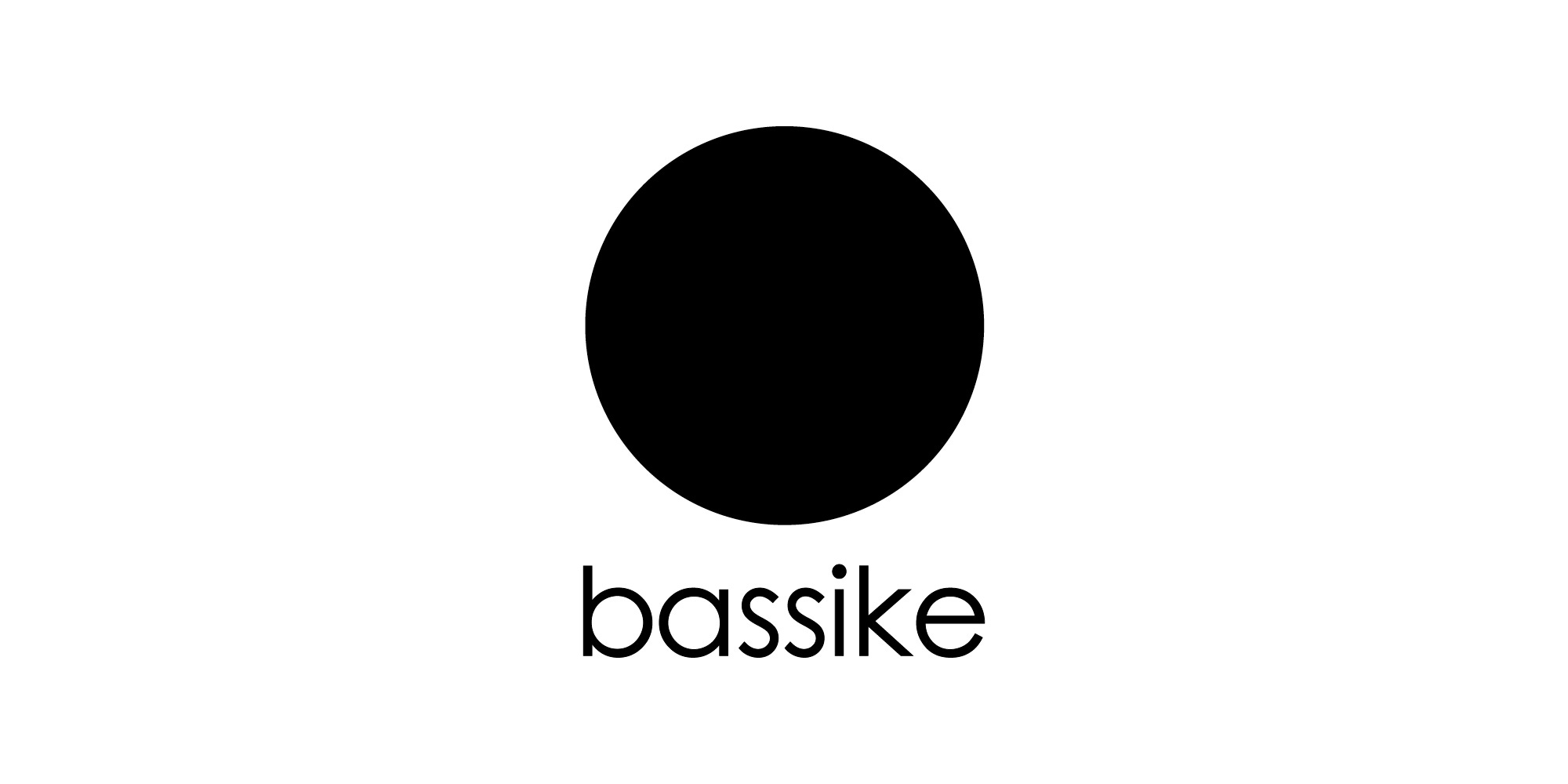
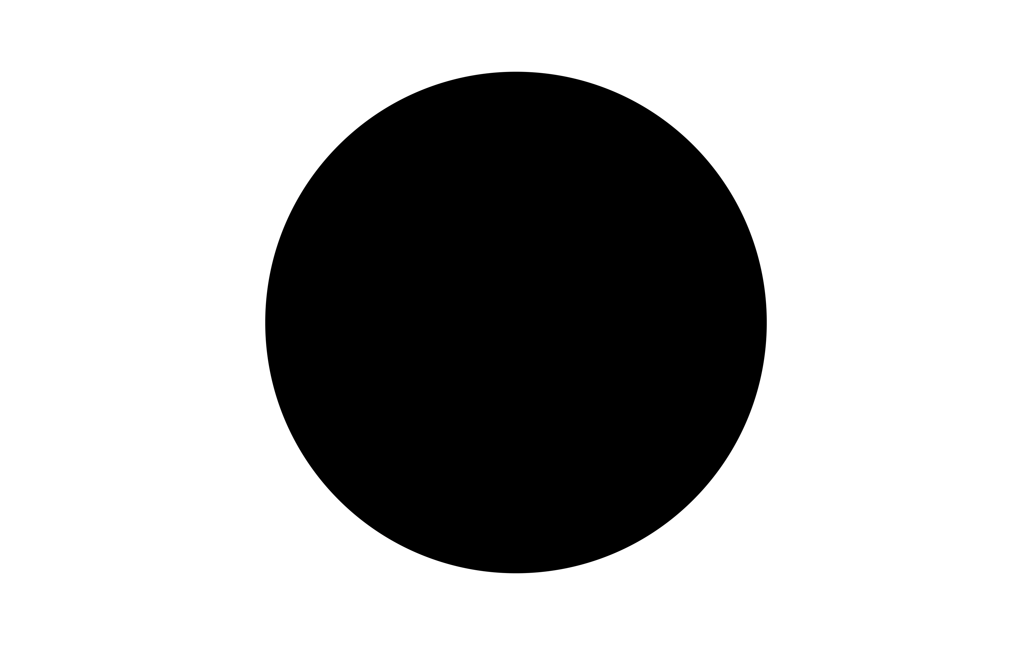
When the fashion label Bassike was born in 2006, Jonathan designed their brand. A black circle and all-lowercase Century Gothic—two things. That’s all. Bassike. The brand, founded by Deborah Sams and Mary Lou Ryan, quickly rose to prominence, known for producing high-quality organic cotton basics made in Australia—and, of course, that iconic black circle.
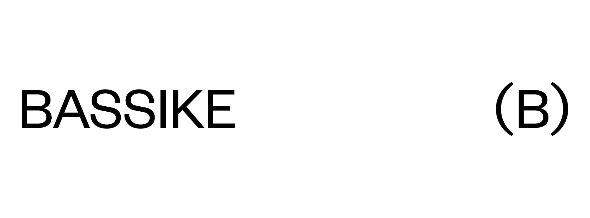
While the strength of Bassike’s simplicity has endured for 18 years, the way brands communicate with their audiences has drastically changed. In 2024, when Bassike came to TRiC to renew their brand, we were presented with two main challenges: the black circle—iconic yet unownable—and the singular lowercase typeface, which restricted hierarchy.
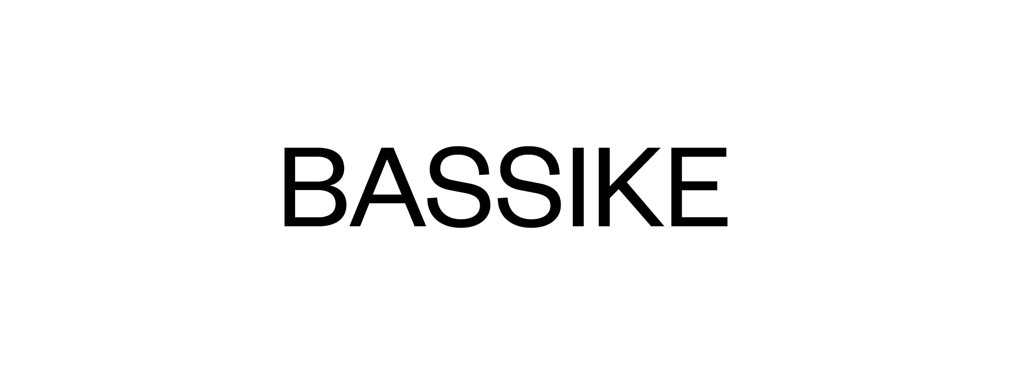
Our approach to the logotype was to move from lowercase to uppercase (with sentence case used outside of the logo) and from a geometric typeface to a grotesk. These two moves were the most gentle intervention we could make to maintain the integrity and unadorned, systematic nature of the brand.
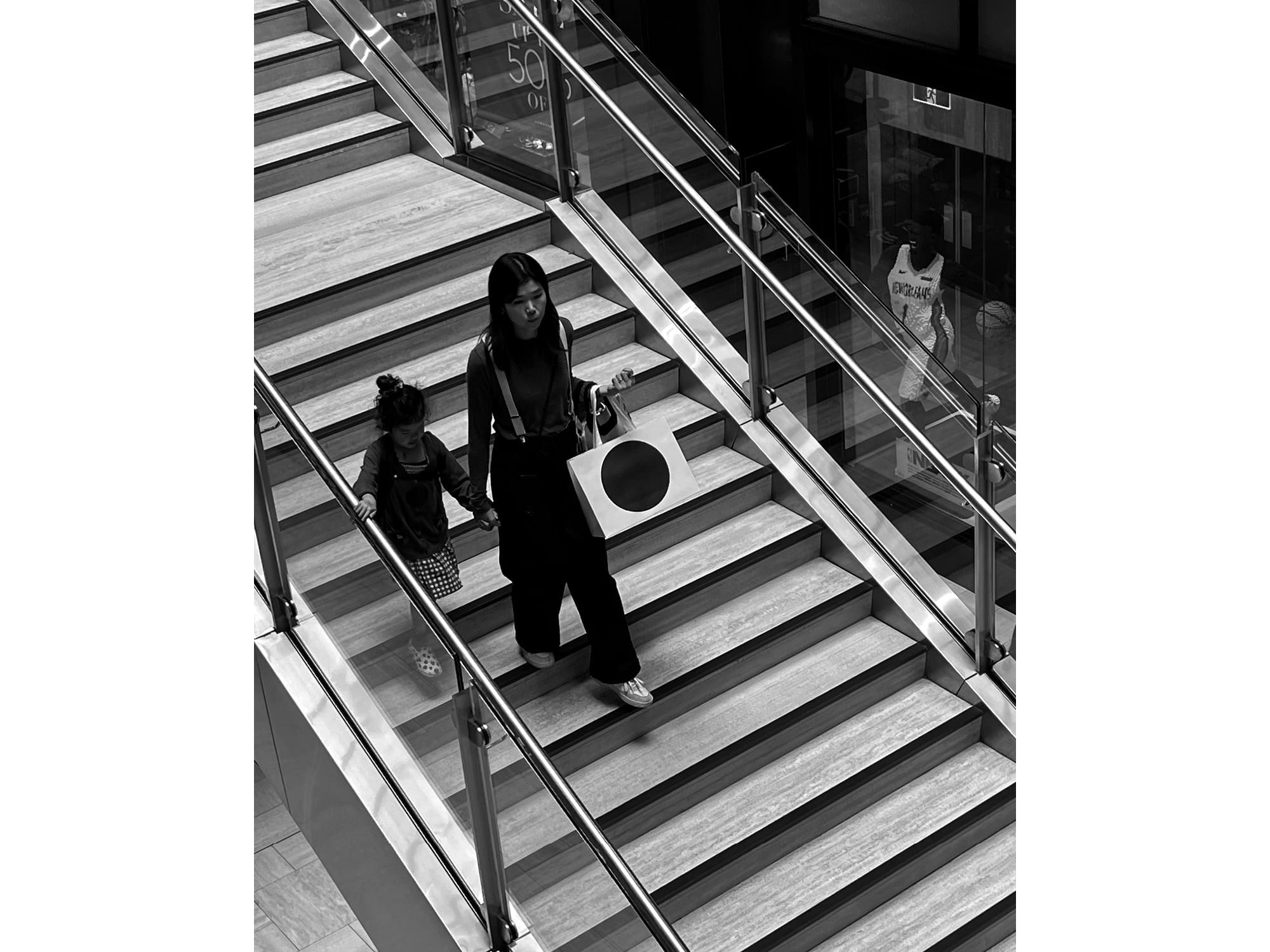
The black circle is a symbol synonymous with Bassike, and despite its omnipresence and use by larger brands (like Sunglass Hut) its ubiquity is the point. The issue here was how to somehow make the circle ownable while keeping it Bassike. A reinforcing moment for us during the process was walking through Melbourne’s Emporium and seeing a bag travelling down one of the central staircases. The power of the circle, as a supergraphic, was undeniable. And while Bassike as a brand doesn’t have the mass appeal of a brand like Sunglass Hut, the point is that it signals to the brand’s audience and draws interest from the enquiring, aesthetic eye.
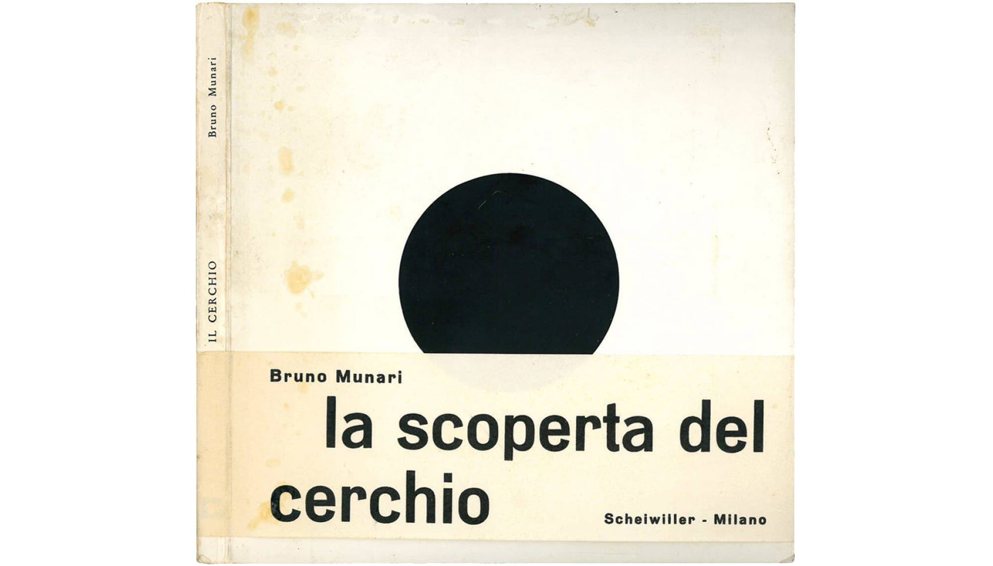
Basic shapes and geometry are things we become aware of in infancy, let alone as foundational principles in design. The circle, in particular, is a great topic, beautifully explored in Bruno Munari’s 1964 book, The Circle: Discovery of The Circle (along with its counterparts, The Triangle and The Square). Our aim was to have the least impact on this shape, leaving it in its purest form.
Intellectual property and ownability are major topics in our field, especially when devising a proprietary brand language. What are the elements that make something unique? What are the elements that make it a brand? A common marker of a brand identity—something that distinguishes it from general visual language—is usually a trademark, copyright, or registered symbol. But that wouldn’t work with a circle.

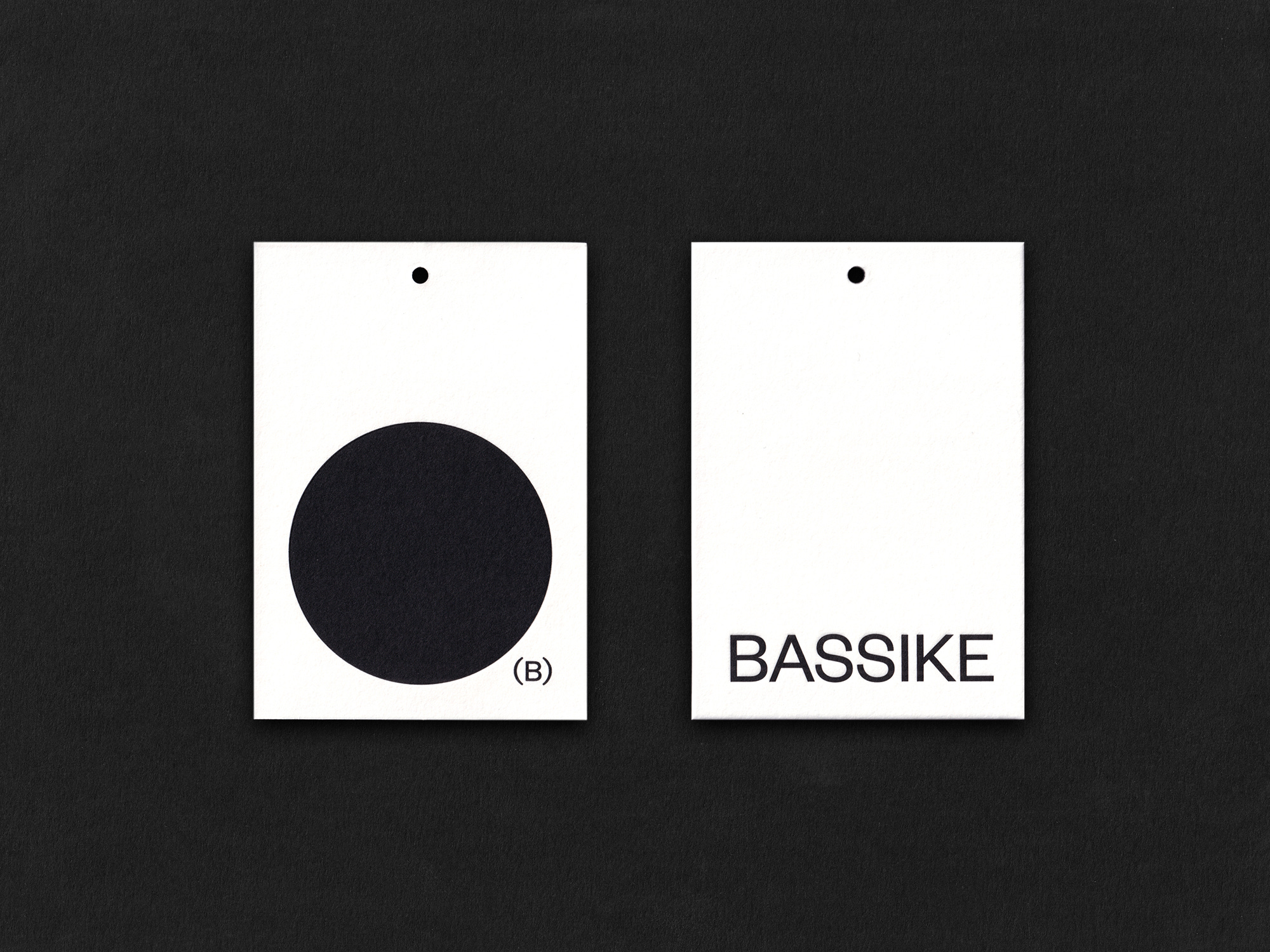
Building on this thinking, we devised a monogram (B) to sit at the bottom corner of the circle—grounding it while taking visual cues from the circle itself, in the bracket’s form, and from the B in the new logotype.
This monogram, borrowing from the rudimentary vernacular of a typographic glyph, anchors the circle while also establishing itself as a distinct symbol existing somewhere between the circle itself, and the Bassike logotype. Moving from here, it appears as an ownable monogram that locks off with the logotype to create another unique arrangement.
Through minimal intervention, the Bassike rebrand is refined and strengthened for the future, rolling out seamlessly across stores, packaging, labelling, collateral, and digital platforms.
Jonathan, I hope the moves we have made resonate with your original vision.
Image credits
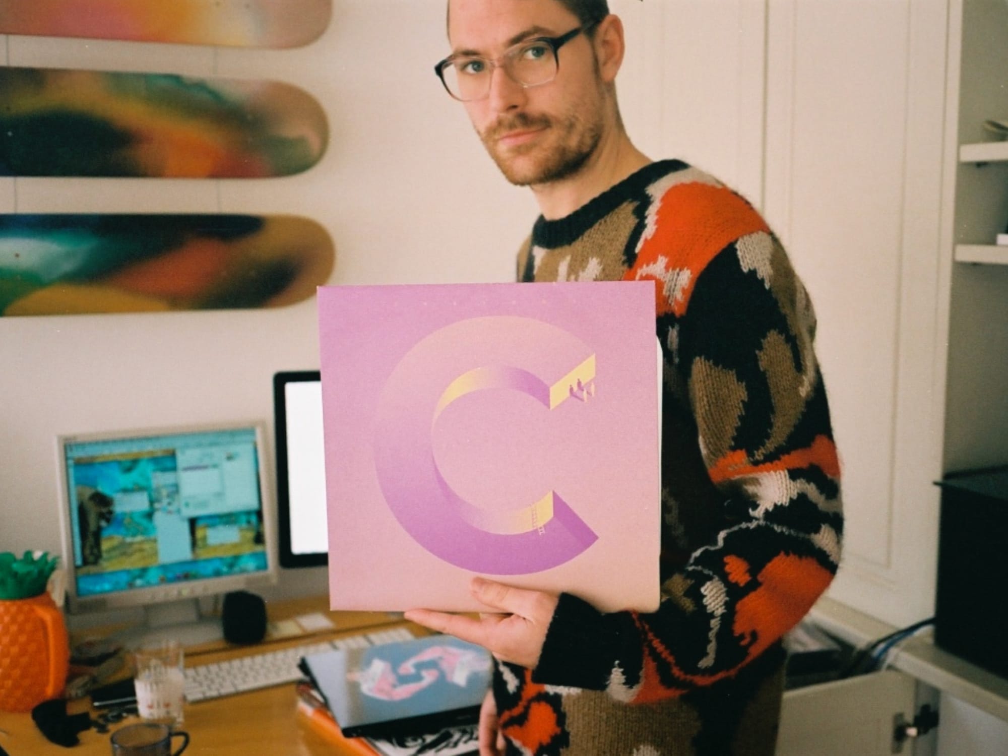
Cliff Hanger, Jonathan Zawada holding his artwork for Canyons, The Lovemore EP, 2008, photographed by Tristan Ceddia in his Elizabeth Bay apartment for The Blackmail, 2009
Bassike circle and logotype, 2006
Bassike logotype, 2025
Bassike shopping bag
The Circle: Discovery of The Circle, Bruno Munari, 1964
Intellectual property symbols
Bassike (B) monogram geometry, 2025
Bassike logotype with (B) monogram, 2025
Bassike swingtag, 2025
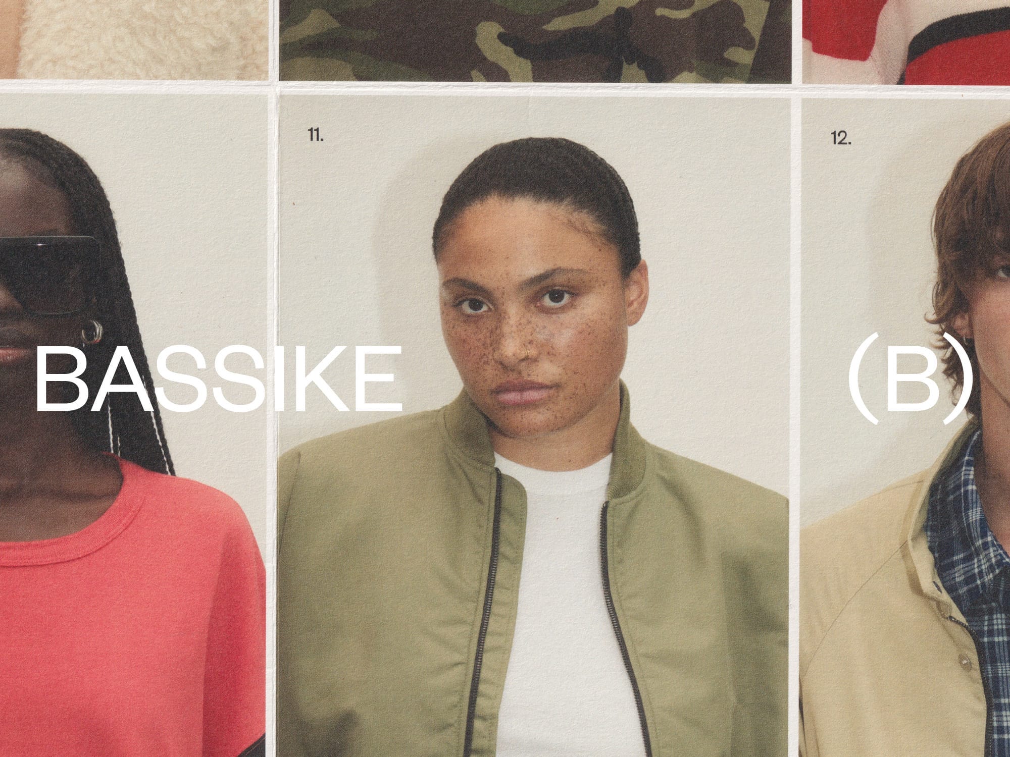
Bassike PC25 photographed by Pierre Toussaint, 2025
Really enjoyed reading this Tristan. As a long time bassike customer, I naturally wondered what was the brief for this rebrand when it recently launched. You've generously let us into the challenges and approach and as expected, your work is always thoughtful and astute.
Such a clever development of the brand and a lovely read. Beautiful work.